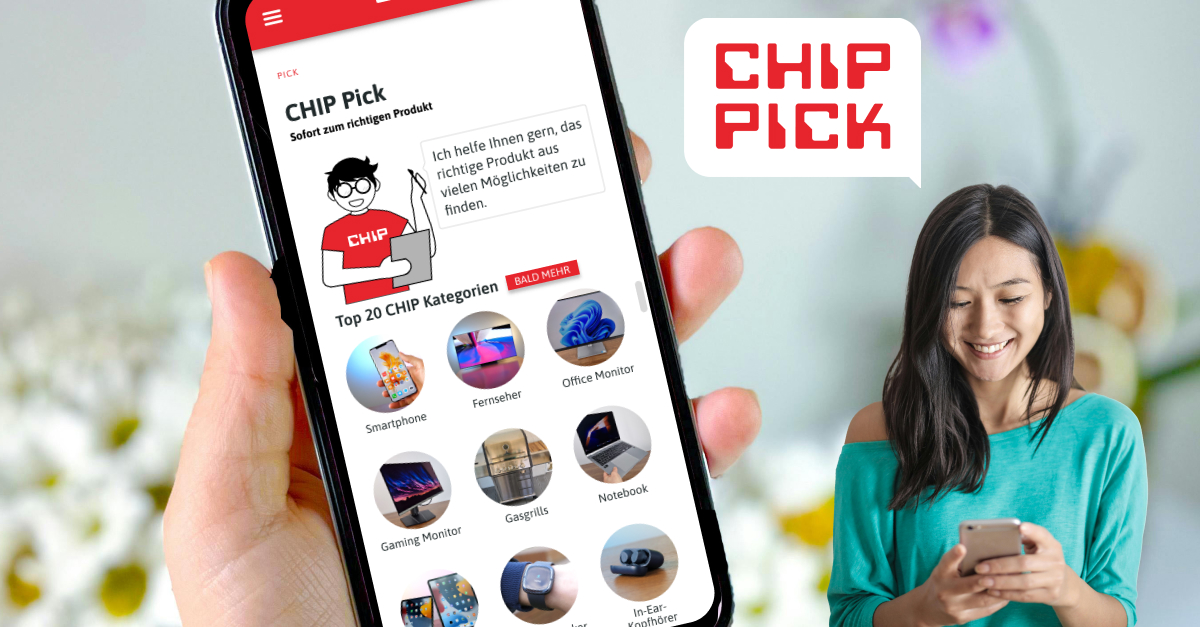
CHIP Pick helps the user to go from an insurmountable amount of products to only a few selected that they can trust and then purchase.
My goal was to streamline the user experience, ensuring that the app not only meets user needs but is also intuitive, visually appealing, trustworthy and accessible to a diverse audience.
As the lead UX/UI Designer, I worked through the entire design process—from user research and prototyping to implementing accessibility improvements and collaborating closely with developers.
My focus was on creating an intuitive and engaging experience, building trust into the product and ensuring its overall usability to ensure users could easily find the product they need.
Creation of Prototypes for User Testing
I developed interactive prototypes to simulate the user experience, allowing stakeholders and test participants to navigate through the proposed design.
These prototypes showcased core functionality and design concepts, and enabled me to gather actionable feedback.
User Interviews
I synthesized findings to create journey maps, aligning the product vision with user needs.
I conducted one-on-one interviews with users to uncover pain points, preferences, and expectations, ensuring that all design decisions were user-centered as well as business driven.
Development of Name and Mascot
Collaborated on the branding of the project, crafting a name and creating a mascot designed to establish a friendly and approachable tone.
Conducted A/B tests and user acceptance testing the age and gender to refine the mascot’s role in building trust and engagement.
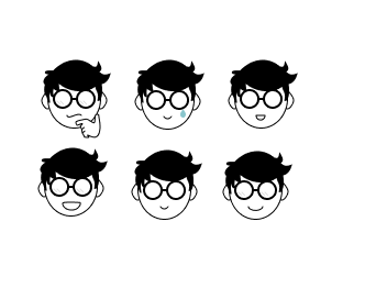
Content Development for Emotional Design
Contributed text and dialogue for the mascot to evoke emotional connection, strengthen user trust, and provide guidance within the product.
Accessibility Assessment
Color Contrast Adjustments: I adjusted the brand’s color palette, specifically the red and green, to meet WCAG accessibility standards, ensuring sufficient contrast for users with color blindness or visual impairments.
I audited the existing design system for accessibility gaps, recommending and implementing adjustments to ensure WCAG 2.1 compliance. Two specific examples are:
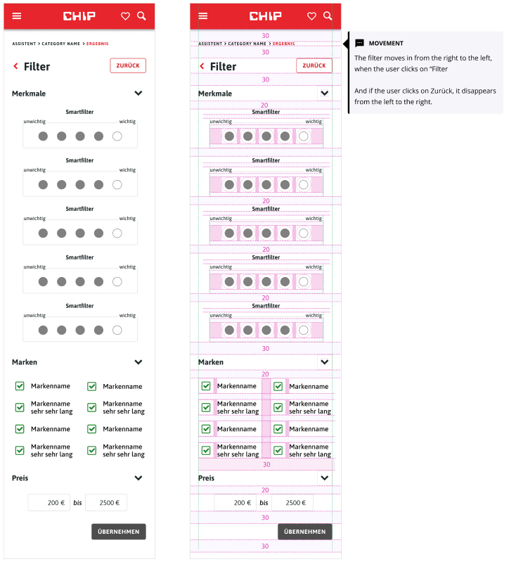
Touch Target Optimization: I ensured that touch targets (buttons, icons, etc.) were sufficiently large and well-spaced to support users with motor impairments or those using assistive touch features.
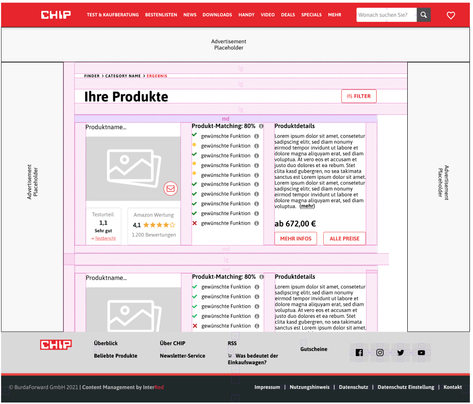
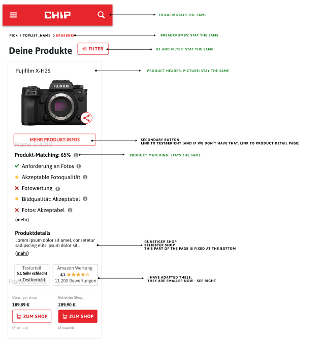
Final MVP Designs
- Delivered polished designs for the MVP, balancing user needs with technical feasibility and business objectives.
- All designs are mobile first.
- I designed screens for a minimum width of 320px, tablet sized screens and desktop sized screens, keeping future ad placements (shown in grey) in mind.
- I focused on visual hierarchy, accessibility, and usability to ensure the design was intuitive and aligned with the CHIP brand identity.
Collaboration with Developers
I worked closely with the development team to clarify requirements, resolve design queries, and ensure accurate implementation. This was especially important as the project had a very tight deadline.
I ensured a smooth handoff by creating detailed documentation, specifications, and design tokens.
Usability Tracking and Insights
- I set up user behavior tracking using tools like Hotjar to identify drop-offs, friction points, and areas of improvement.
- I designed dashboards to analyze data, translating insights into iterative design improvements.
Iterative Feature Development
- I designed new features and enhancements based on user feedback, analytics, and stakeholder input.
Alignment with Product Vision
I contributed to the strategic development of the product by creating designs for features that supported long-term goals.
Final Thoughts and Learnings:
This project taught me the importance of creating a seamless and inclusive experience from both a design and accessibility standpoint. Working with a diverse range of users highlighted the need to consistently assess and iterate on user needs throughout the development process.
A key takeaway was the role of user trust in driving engagement. The mascot and the emotional design elements we implemented were integral to making the product feel approachable, yet professional. This approach demonstrated that visual design and content aren’t just about aesthetics—they are powerful tools for building relationships with users.
The collaboration with developers was another invaluable learning experience. Clear documentation and consistent communication were crucial for a smooth handoff, especially with a tight timeline. I also learned how to balance technical feasibility with creativity, ensuring that the final designs were not only visually appealing but also practical for implementation.
Through the use of analytics and iterative testing, I understood how to continuously refine features based on real user data. This approach of testing, analyzing, and iterating has become a critical aspect of my design process, ensuring that user needs are always at the forefront.
Ultimately, this project reinforced the value of empathy, flexibility, and collaboration in creating user-centered designs that are both functional and emotionally engaging. It was a great reminder that design is a constant evolution, and staying open to feedback and improvement is key to delivering a successful product.
