My design work for aifora is under NDA. I still want to show my skills in the area of dashboard building for desktop, so I did this case-study!
Created: February 2023
My role: Conception and UI Design, Logo Design
Duration: 6 hours
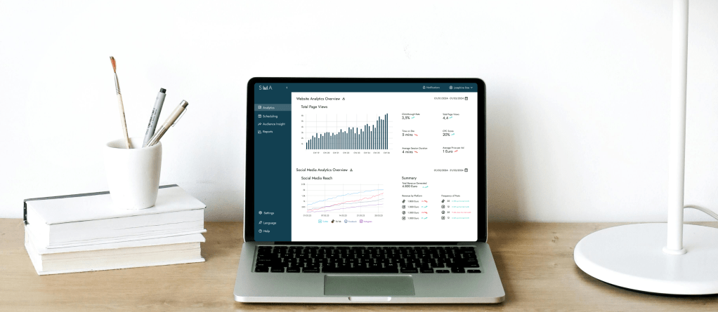
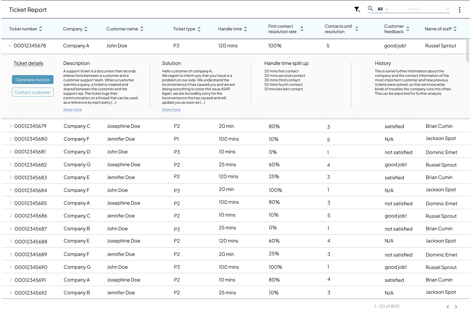
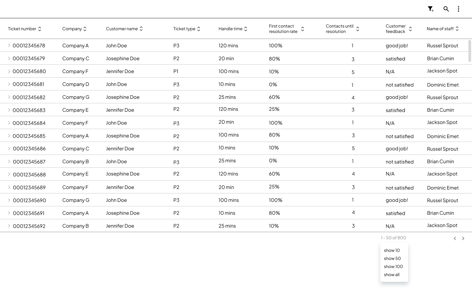
Goal: Create a dashboard for social media analytics for a busy social media manager who needs all the important information at one glance.
My goal was to design a minimalist, modern and sleek looking dashboard where all the most important KPIs are easily accessible. After researching the most important KPIs for social media, I created a design system to put together a cohesive looking dashboard.
My main focus was to have the KPIs stand out so they could easily be perceived and save the social media manager time and effort.
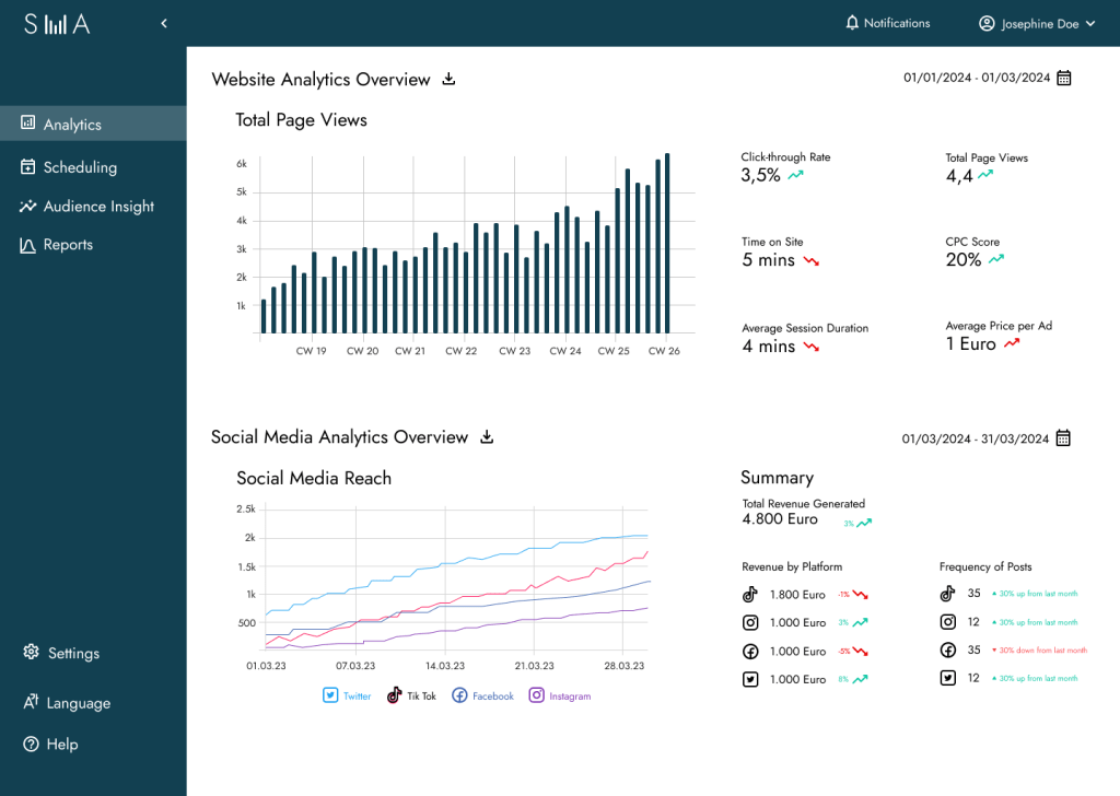
As I have the design skills but not the social media knowledge, I asked chatgpt for the most important KPIs that a social media manager would have to look up. I then designed it in an appealing manner.
This design system showcases the core visual language I developed for the project, including the logo, typography, iconography, spacing, and color usage.
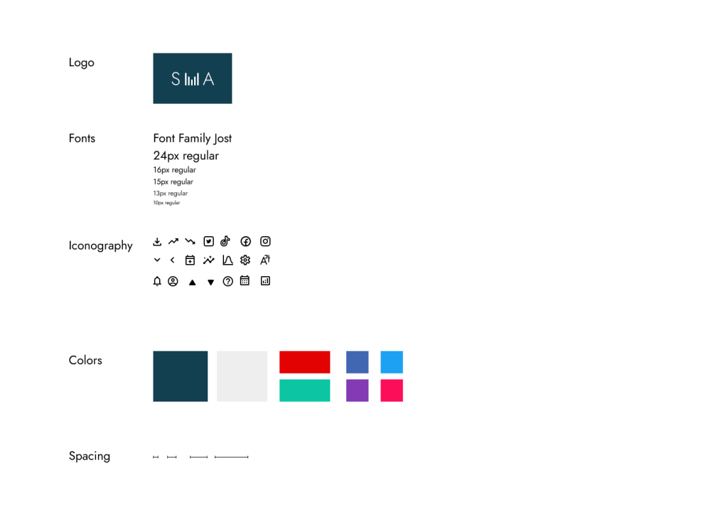
I selected Jost as the primary typeface for its clean, modern appearance that aligns with the dashboard’s minimalist and professional aesthetic. In contrast, the icon set introduces a subtle sense of playfulness through its soft, delicate lines—bringing balance and a touch of personality to the interface.
For the color scheme, I chose a deep blue for the side and top navigation, drawing on its association with trust and reliability in color psychology. The light grey background helps visually separate and structure the layout, enhancing clarity and focus.
When designing the data visualizations, I kept the website analytics graph clean and neutral to maintain clarity. For the social media graphs, I introduced a more engaging touch by using each platform’s signature brand colors. This allows Social Media Managers to instantly associate each line in the chart with its respective platform—creating a rich, multi-line visualization that remains intuitive and easy to interpret.
Final Thoughts & Learni
Through my work at aifora, I developed a solid foundation in making analytics tools usable and visually engaging—especially for B2B contexts where clarity and precision matter most.
Designing dashboards like this one requires a combination of UX expertise and strategic thinking, including:
- Information hierarchy – to prioritize what users need to see first and reduce cognitive load
- Interaction design – to ensure filters, hover states, and dynamic elements support real user goals
- Data visualization – to present key metrics in a way that’s intuitive and immediately meaningful
- Visual consistency – to align typography, color, spacing, and component behavior across the interface
- Task flow analysis – understanding user goals and mapping the paths they take to reach them
- Stakeholder alignment – translating business needs into usable components without overwhelming the user
- Microcopy writing – crafting labels, tooltips, and empty states that guide users clearly
- Design tokens & component systems – maintaining consistency at scale with reusable patterns
- Cross-functional collaboration – working closely with product managers and developers to ensure feasibility
- User research & testing – validating what metrics matter to users and how they interpret them
- Error prevention & edge case handling – anticipating user mistakes and making systems more forgiving
- Progressive disclosure – showing the right level of detail at the right moment
- KPI awareness – understanding how dashboard design affects conversion, engagement, and decision-making
If you’re interested in seeing more, feel free to reach out—I’d be happy to share the Figma prototype.
